TASK 1: EXERCISES

Ang Siu Boon (0345135)
Design Principles (Bachelor's Degree (Hons) in Computer Science)
Exercises
CONTENTS
- Instructions
- Recap of Selected Design Principle
- Design Process
- Reflection
INSTRUCTIONS
RECAP OF SELECTED DESIGN PRINCIPLES:
Contrast :

|
| Figure 1.0 Contrast Research |
Contrast occurs when two or more visual elements in a composition are different. In design we use contrast to generate impact, highlight importance, create exciting graphics and create visual interest and dynamics.
Balance :

|
| Figure 1.1 Balance Research |
Emphasis:

|
|
Figure 1.2 Emphasis Research |
Emphasis is the part of the design that catches the viewer's attention.
Usually, the artist will contrast one region with other parts to draw
attention to it. The region could vary in terms of its size, color,
texture, shape. The viewer's eye moves through the piece of art,
frequently to focal points.
DESIGN PROCESS
For my designs I planned to create the posters based on the latest hit
movies. I researched some of the top ranking movies and went ahead to
search for some reference.

|
| Figure 2.0 IMDb Moviemeter Chart as of SEP 10 2023 |
1. CONTRAST
For 'CONTRAST', I went with 'Oppenheimer' starring Cillian Murphy. The summary of the movie was a documentary about Julius Robert Oppenheimer which was starred by Cillian on his journey to invent the atomic bomb which is a nuclear weapon that is said to "Destroy Worlds". Hence would like to contrast the fear, guilt, destruction and power.
For 'CONTRAST', I went with 'Oppenheimer' starring Cillian Murphy. The summary of the movie was a documentary about Julius Robert Oppenheimer which was starred by Cillian on his journey to invent the atomic bomb which is a nuclear weapon that is said to "Destroy Worlds". Hence would like to contrast the fear, guilt, destruction and power.

|
| Figure 2.1 Oppenheimer Film Poster 2023 |
My initial idea was to 'CONTRAST' the deadly destructive
force of the atomic bomb. These are the few references that I
obtained online that I will be using for the poster

|
| Figure 2.2 Christopher Nolan Portrait as Oppenheimer |

|
| Figure 2.3 Mushroom Cloud effect of Atomic Bomb (Hiroshima, AUG 6 1945) |
After several searches, I decided to use the above 2 grayscale
image which could be used to portray sadness and despair as in
many cultures, these 2 colors are often associated with life and
death which coincidentally relate to the movie.

|
| Figure 2.4 All layer filter effect in Photoshop |
At first I had tough decisions on how I would like to portray the
message. I had thoughts on combining the explosion to the tip of
his cigarette, but in the end I played with the blending option in
Adobe Photoshop and I finally chose the 'Overlay' filter.

|
| Figure 2.5 Overlay filter on |
As we can see I can't just use the effect and call it a day, I
then created mask on the two image and used the brush tool to make
things more detailed so that the image looks more natural

|
| Figure 2.6 Adding Mask and fixing details |
Adding the masks made Cillian's face more pronounced. His eyes
also looked more clear as I felt his emotion of guilt of
inventing the atomic in the picture which is what I intend to
illustrate.

|
| Figure 2.7 After adding mask |
However, we are still not done. The theme is
'CONTRAST' which I need to add some eye-catching elements
to the image. I added another layer of 'Color Dodge' to add some
color onto his cigarette.

|
| Figure 2.8 Color Dodge filter on Cigarette. |
I felt that the color was not dominant enough as it is quite
small since the image has a lot of details and elements.
Hence, I then added the same effect onto the Mushroom Cloud.

|
|
Figure 2.9 Color Dodge filter |

|
|
Figure 2.10 First Final Draft |
I had some feedback from Dr. Yip, she advised me to remove
the orange layer but instead remain the black white feel to
the picture is enough to bring out the contrast of the
poster. I added another contrast layer and did some tweaking
in Photoshop

|
|
Figure 2.11 Adding Contrast Layer |
EXPERIMENT

|
|
Figure 2.11 Contrast Experiment 1 |

|
|
|
Lastly, with the opinions of Dr. Yip, I tweaked the
contrast of the clouds, eyes, and cigarette to make the
poster more contrasting.
FINAL

|
|
Figure 2.13 Final 'Contrast' Poster |
Rationale : As stated in the summary.
Oppenheimer was called the "father of atomic bomb", He has
regretted on inventing the atomic bomb and I would like to
portray the meaning in this poster. I wanted
to 'CONTRAST' the amount of guilt in
relationship to the destructive force of the atomic bomb
which was able to kill millions of people. The color black
and white which I mentioned earlier, was meant to
symbolize life and death, where it is very suitable for
contrasting the message to the viewer.
2. BALANCE
For the second theme 'BALANCE', I chose the movie 'The
Little Mermaid' but instead of the live-action film, I went with
the animated version which in summary is about a rebellious 16
year-old mermaid who is fascinated with life on land and somehow
managed to made a deal with a sea witch which turns her into a
human for 3 days for a price, her voice. My idea was to create a
balance poster which express the balance between the life
between sea and land.

|
|
|
I loved this shot of Ariel reaching out to the surface of the
ocean wanted to be apart of human world. I felt this image had a
strong meaning of wanting freedom which appealed to me to add it
into my poster.

|
| Figure 3.1 Artwork of The Little Mermaid, Ariel |
I searched for a binary image of Ariel for the poster and this
is what I was able to obtain

|
|
Figure 3.2 Binary image of Ariel |

|
|
Figure 3.3 Disney Princesses Autonomy |


|
| Figure 3.6 Mermaid and Human Ariel together |
Next I added some details, colors and effect to give some live
into the poster. I first decided the water color as mermaid has
to be in water. Then I used the Eyedropper tool to get the color
code which is #019dda and went to
www.canva.com/colors/color-wheel/ to get the complementary color which is #DA3E01 for
the sky color.

|
| Figure 3.7 Canva Color Wheel |

|
| Figure 3.8 Poster with Complementary Color |
I felt the poster was a bit dull and boring and I decided to
add some elements into it. I decided to add a circle to give
it another element for the poster. I then decided to use the
circle as the sun as the sky complementary color almost
resemble a sunset color.

|
| Figure 3.9 Adding circle onto the poster |

|
|
Figure 3.10 Added sunset |
After I was done, I felt that the sunset has made the poster
lost its balance. Then I decided to bring the circle layer
to the front to make a full circle to remain the balance in
the poster. And then I have done the
'BALANCE' poster

|
|
Figure 3.11 Balance First Draft |
Dr. Yip said that the balance was not enough and asked
me to add some elements to the poster. Firstly, she
advised me to bring the mermaid version of Ariel
slightly upwards. Instead I added a diagonal line
connecting the edges of the poster as a guideline on the
placement of the Ariels.

|
|
Figure 3.12 Line guide for Ariel placement |
Next, I changed the saturation of the water waves as
instructed by Dr. Yip to bring out the contrast in the
poster. Dr. Yip also gave some ideas to add some elements
to rebalance the wave effect such as adding mountains to
the upper area. I also had some ideas in mind and I tried
it out.

|
|
Figure 3.13 Changed Saturation and Added
Mountains |

|
|
Figure 3.14 Added sunset elements |
After trying out the advise Dr. Yip gave and my idea. I
did not let my imagination stop. Instead I tried
combining both ideas into my poster.

|
|
Figure 3.15 Combining both Ideas |
Although Dr. Yip did not encouraged one of my ideas where
I wanted to add some fishes and birds to bring out the
'BALANCE' more, I still went ahead to try them out.
As there is a quote that goes "Never try, never know".

|
|
|
My initial thought was to Dr Yip, advised to remove the fish
as it doesn't always have to balance it out.
FINAL OUTCOME

|
|
|
Rationale : The reason I chose The Little Mermaid for
this principle is quite simple. The word 'BALANCE' defines the even distribution of things. The Little
Mermaid takes places in the ocean and land, which is
a 'BALANCE' of nature where our earth is split into SEA
and LAND/SKY. There are two lifeform in the movie
which are Aquatic Vertebrate (Mermaid) and
Homosapien (Human) which also brings 'BALANCE' which
I wanted to depict. Thus, there is no other movie
more suitable for the principle of 'BALANCE'
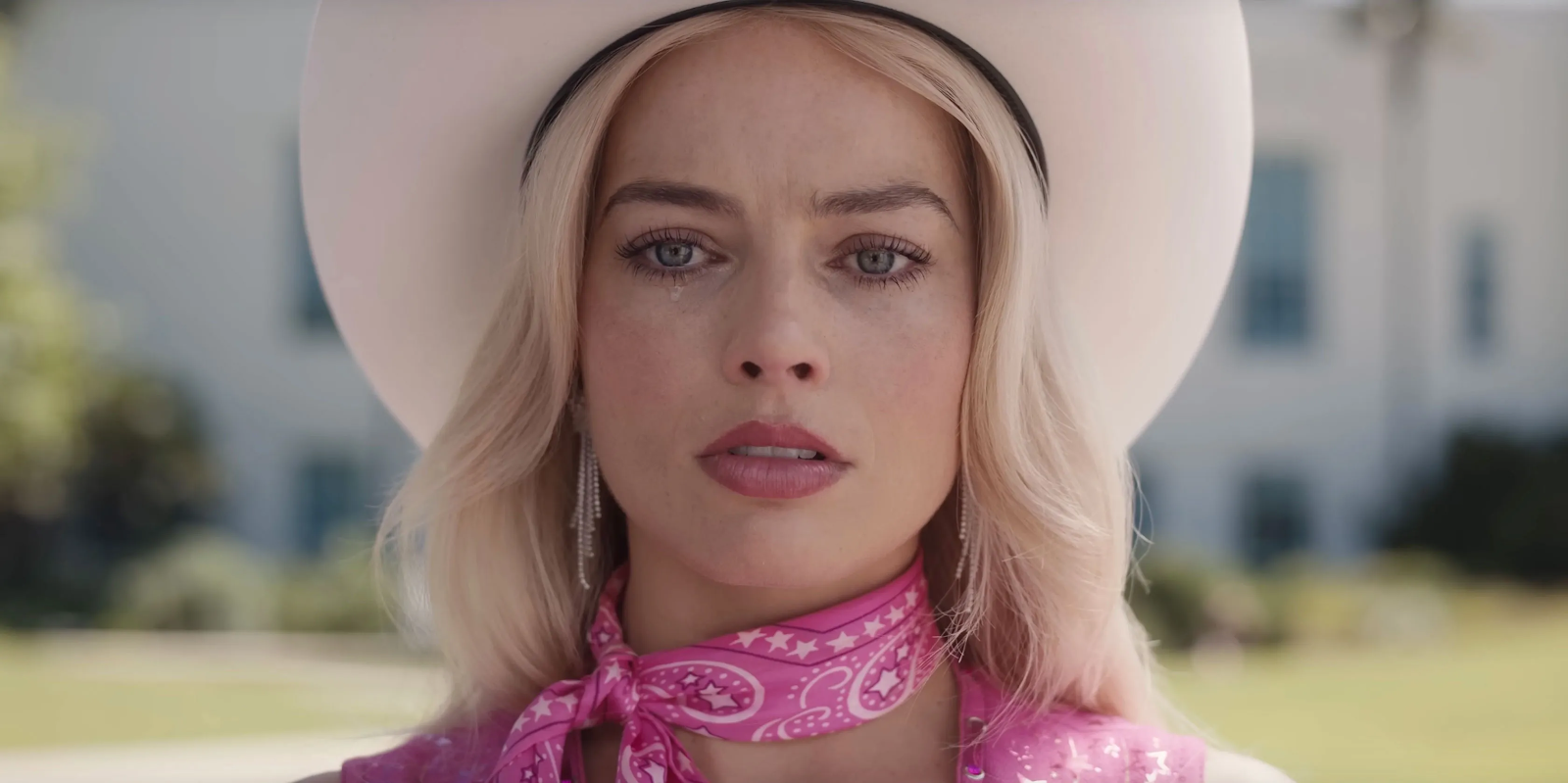
2. EMPHASIS
For the last theme 'EMPHASIS', The perfect
movie of choice that I picked was 'Barbie'. The story is
about Barbie that was starred by Margot Robbie who was
living in Barbieland which was supposed to be a perfect
place for all the Barbies in the world. However, Barbie
suddenly experienced an existential crisis. She then have
to set on a journey to the real world in order to
understand herself and discover her true purpose and soon
discover the joys and perils of living among humans. I
would like to emphasize the imperfections of barbie
throughout the poster.

|
|
Figure 4.0 Barbie movie 2023 Poster |

|
|
Figure 4.1 Base Draft for Barbie Poster |
Barbie is a usually a happy and vibrant word, In which adding the black logo can attract viewer's attention which is the main purpose of 'EMPHASIS'. I then continue to search online for some sample vector and add into the poster for some extra touches.

|
|
Figure 4.2 Sample Barbie Vectors |

|
| Figure 4.3 Added some elements |
It is basically done, but I feel that the poster does not feel lively enough. I looked for crucial and major scene from the movie to 'EMPHASIS' the messages that they left.

|
|
Figure 4.4 Meeting Peculiar Barbie |

|
|
Figure 4.5 Barbie learning about Cellulite |

|
| Figure 4.6 Kens overthrowing Barbieland |

|
| Figure 4.7 Depressed Barbie |
|
|
Figure 4.8 Emotional Barbie |

|
|
Figure 4.9 Meeting the founder Ruth Handler |
I obtained these scenes which are major event from the movie with deep
meaning and compile them into a collage. I then mask the collage with
the Barbie Logo do give it some depth and live into it.

|
|
Figure 4.10 Masking Collage with Logo |
The color of the collage cause to much commotion and makes it hard to
perceive. Hence, I added some contrast and saturation layer to make it
more faded.
|
|
Figure 4.11 Adding adjustment layer |

|
| Figure 4.12 Adjusted collage |
I already love the outcome but, I added one more tiny detail which is
a major quote in the story that goes
“Barbie is all these woman. And all these women are
Barbie.”
EXPERIMENTS

|
|
Figure 4.13 Experiments with Background 1 |

|
|
Figure 4.14 Experiments with Background 2 |

|
|
Figure 4.15 Experiments with Background 3 |

|
|
Figure 4.16 Experiments with Background 4 |

|
|
Figure 4.17 Experiments with Background 5 |

|
|
Figure 4.18 Experiments with Background 6 |

|
|
Figure 4.19 Experiments with Background 7 |

|
|
Figure 4.20 Experiments with Background 8 |
Dr Yip then advised me to remove the background as it is
quite jarring and draws away the attention from the center
which will reduce the impact of Emphasis. I then retried
without the background vectors.

|
|
Figure 4.21 Experiments without Background 1 |

|
|
|

|
|
|
Lastly, Dr Yip and I decided on the one with the most striking
pink which brings out the contrast and able to emphasize the
content more.
FINAL

|
|
|
Rationale : Barbie to a lot of people seems like a jolly
and perfect being. If you have seen the movie Barbie, your
perspective of it will change. Hence, the principle of
'EMPHASIS' is fitting for the movie Barbie. In this poster, I
would like to 'EMPHASIS' on the imperfections or flaws of
Barbie. The collage which are major events shows the other side of
perfections where each scenes has their own deeper meaning. The
quote also justify that it is alright to be imperfect in which it is
the beauty and uniqueness of each women.
REFLECTION
Designing three posters with a focus on the design principles of
contrast, balance, and emphasis has been an educational and inspiring
process. In terms of conception and execution, each poster presented a
distinct challenge, so I'm eager to look back on the procedure.
Throughout the process of creating these posters, I discovered that a
thorough comprehension of the principles is a crucial component of
successful design. I was able to experiment with various design elements
for each poster, which helped me effectively communicate the essence of
the principle. The fact that these ideas are frequently connected also
occurred to me. For instance, achieving balance can involve carefully
choosing contrast, and contrasting elements can emphasize a point.
Finally, the process of creating these design principles posters has
been both educational and motivating. It has emphasized the significance
of these concepts in generating effective and visually appealing
designs. These posters serve as both a creative presentation and a
reminder of the essential ideals that underpin effective design work.
They demonstrate the power of visual communication and the significance
that design principles play in effectively communicating messages.
Comments
Post a Comment